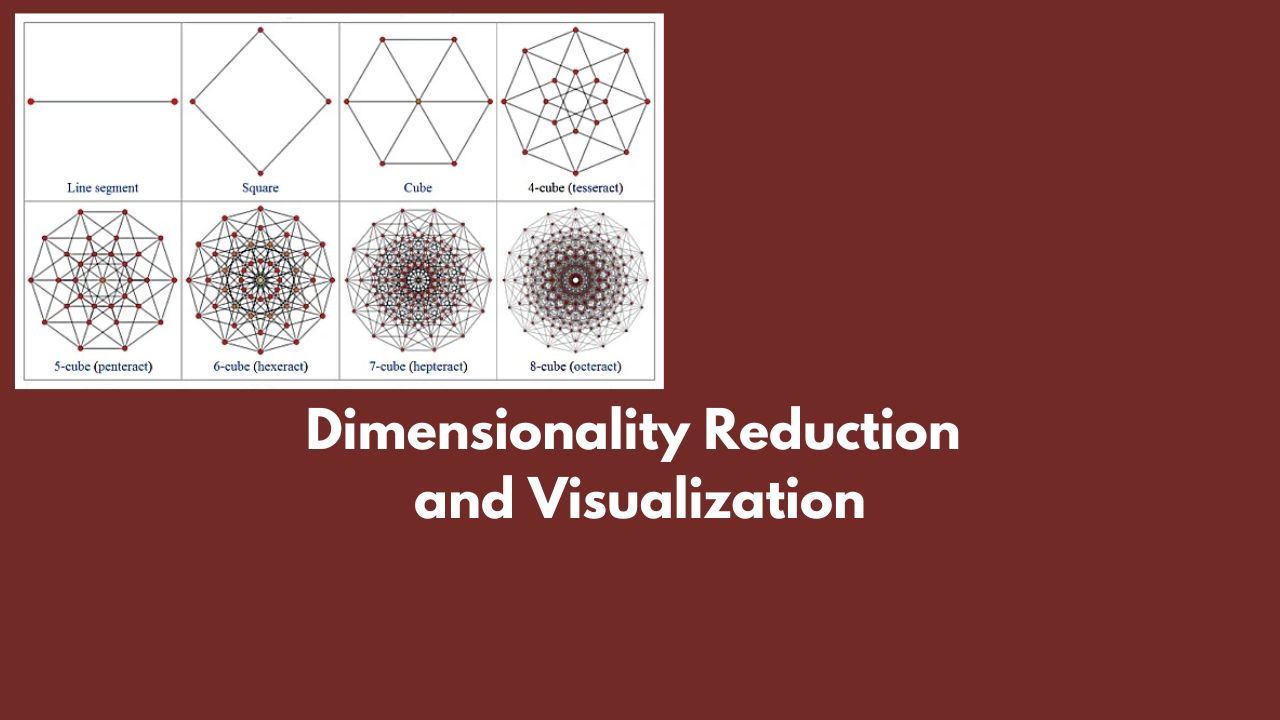
Dimensionality Reduction and Visualization #
What are the popular methods of dimensionality reduction? #
Dimensionality reduction is a crucial step in data preprocessing, particularly when dealing with high-dimensional datasets. It helps in reducing the number of features while retaining the essential information, improving computational efficiency, and facilitating data visualization. Here are some popular methods of dimensionality reduction:
Linear Methods #
-
Principal Component Analysis (PCA):
- Description: PCA transforms the data into a set of linearly uncorrelated components, ordered by the amount of variance they explain.
- Use Case: Useful for datasets where the directions of maximum variance are important.
- Implementation:
sklearn.decomposition.PCA
-
Linear Discriminant Analysis (LDA):
- Description: LDA aims to find a linear combination of features that best separate two or more classes.
- Use Case: Supervised learning, particularly in classification tasks.
- Implementation:
sklearn.discriminant_analysis.LinearDiscriminantAnalysis
-
Factor Analysis:
- Description: Assumes that the observed variables are linear combinations of potential factors plus noise.
- Use Case: Used for identifying hidden variables that explain observed data.
- Implementation:
sklearn.decomposition.FactorAnalysis
Non-Linear Methods #
-
t-Distributed Stochastic Neighbor Embedding (t-SNE):
- Description: A non-linear technique that reduces dimensions while preserving the local structure of the data.
- Use Case: Visualization of high-dimensional data, especially for clustering.
- Implementation:
sklearn.manifold.TSNE
-
Uniform Manifold Approximation and Projection (UMAP):
- Description: A non-linear method that preserves both local and global data structure, often faster than t-SNE.
- Use Case: Visualization and understanding of high-dimensional data.
- Implementation:
umap.UMAP
-
Kernel PCA:
- Description: An extension of PCA using kernel methods to capture non-linear relationships.
- Use Case: When the data has non-linear relationships that standard PCA cannot capture.
- Implementation:
sklearn.decomposition.KernelPCA
-
Isomap:
- Description: Combines PCA and multi-dimensional scaling (MDS) to preserve global geometric structures.
- Use Case: Non-linear dimensionality reduction maintaining global relationships.
- Implementation:
sklearn.manifold.Isomap
-
Locally Linear Embedding (LLE):
- Description: Preserves local structure by linearizing local patches of the manifold.
- Use Case: When the data lies on a non-linear manifold.
- Implementation:
sklearn.manifold.LocallyLinearEmbedding
Autoencoders #
- Autoencoders:
- Description: Neural networks that learn to compress data into a lower-dimensional representation and then reconstruct it.
- Use Case: Complex non-linear relationships in large datasets.
- Implementation: Libraries like TensorFlow or PyTorch
Others #
-
Independent Component Analysis (ICA):
- Description: Separates a multivariate signal into additive, independent components.
- Use Case: Situations where the goal is to find underlying factors that are statistically independent.
- Implementation:
sklearn.decomposition.FastICA
-
Random Projection:
- Description: Projects data to a lower-dimensional space using a random matrix.
- Use Case: When computational efficiency is more critical than exact dimensionality reduction.
- Implementation:
sklearn.random_projection
-
Non-negative Matrix Factorization (NMF):
- Description: Factorizes the data matrix into two matrices with non-negative entries.
- Use Case: When the data is non-negative and parts-based representation is meaningful.
- Implementation:
sklearn.decomposition.NMF
Practical Considerations #
- Data Size: Large datasets might require more computationally efficient methods like PCA or Random Projection.
- Non-Linearity: Use non-linear methods like t-SNE, UMAP, or Kernel PCA if the data has complex non-linear relationships.
- Supervised vs. Unsupervised: LDA is a supervised method useful for classification, whereas methods like PCA, t-SNE, and UMAP are unsupervised.
Example Implementations #
PCA Example #
from sklearn.decomposition import PCA

# Assuming X is your data matrix
pca = PCA(n_components=2)
X_reduced = pca.fit_transform(X)
t-SNE Example #
from sklearn.manifold import TSNE

# Assuming X is your data matrix
tsne = TSNE(n_components=2, perplexity=30, n_iter=300)
X_reduced = tsne.fit_transform(X)
UMAP Example #
import umap

# Assuming X is your data matrix
umap_reducer = umap.UMAP(n_components=2)
X_reduced = umap_reducer.fit_transform(X)
Selecting the appropriate dimensionality reduction technique depends on the specific requirements of your analysis, such as the size and nature of the data, computational resources, and the intended use of the reduced dimensions (e.g., visualization, further modeling).
Discuss Dimensionality Reduction using t-SNE #
tsne = TSNE(n_components=2, random_state=42, n_iter=5000, perplexity=5)
The TSNE function is from the scikit-learn library and stands for t-distributed Stochastic Neighbor Embedding. It is used for dimensionality reduction, particularly for the visualization of high-dimensional data. Here’s the explanation of each parameter:
-
n_components: This parameter determines the number of dimensions in the embedded space. In this case,n_components=2means that the data will be reduced to 2 dimensions, which is suitable for 2D visualization. -
random_state: This parameter sets the seed for the random number generator. Providing a fixedrandom_state=42ensures that the results are reproducible, meaning you will get the same output each time you run the code with this seed. -
n_iter: This parameter specifies the number of iterations for optimization. The default value is usually 1000, but here it is set to5000, which means the optimization process will run for 5000 iterations. More iterations can lead to a more accurate embedding but will take more time. -
perplexity: This parameter is related to the number of nearest neighbors that is used in other manifold learning algorithms. It is a measure of the effective number of neighbors. A lower perplexity like5might be useful for smaller datasets, while higher values are suitable for larger datasets.
So, this line of code configures the t-SNE algorithm to reduce the data to 2 dimensions, with a fixed random seed for reproducibility, performing 5000 iterations of optimization, and considering 5 nearest neighbors for the perplexity parameter.
What is perplexity in t-SNE? #
Perplexity and its Role in t-SNE #
Perplexity is a parameter in t-SNE that balances the attention between local and global aspects of your data. It is related to the number of nearest neighbors considered when computing the pairwise similarities in the high-dimensional space.
Detailed Explanation: #
-
Probabilistic Interpretation:
- In t-SNE, each data point ( i ) has a probability distribution over all other points ( j ), indicating how likely it is that ( j ) is a neighbor of ( i ).
- Perplexity is a measure of how concentrated this distribution is, which directly impacts how many neighbors influence the positioning of each point in the embedded space.
-
Mathematical Definition:
- Perplexity ( P ) is defined as ( 2^{H(P_i)} ), where ( H(P_i) ) is the Shannon entropy of the probability distribution ( P_i ) over other points.
- Shannon entropy ( H(Pi) = - \sum{j} P*{ij} \log P*{ij} ).
- In simpler terms, perplexity can be thought of as a smooth measure of the effective number of neighbors for each point.
-
Effect on Embedding:
- Low Perplexity (e.g., 5):
- The algorithm focuses more on local structure.
- Each point considers fewer neighbors.
- Useful for small datasets or when you want to capture fine-grained local relationships.
- High Perplexity (e.g., 30-50):
- The algorithm takes into account a broader neighborhood.
- Each point considers more neighbors.
- Suitable for larger datasets or when you want to preserve more global structure.
- Low Perplexity (e.g., 5):
Practical Implications: #
- Smaller Datasets:
- Fewer data points mean each point has fewer potential neighbors. A lower perplexity (e.g., 5) ensures that t-SNE captures the local structure well without being too influenced by distant points.
- Larger Datasets:
- More data points mean more potential neighbors. A higher perplexity (e.g., 30-50) helps in capturing the global structure by considering a wider neighborhood around each point, preventing the embedding from being too noisy.
Choosing the Right Perplexity: #
- There is no one-size-fits-all value for perplexity; it often requires some experimentation.
- Common practice is to try a few different values (e.g., 5, 10, 30, 50) and visually inspect the resulting embeddings to choose the best one.
- The default value in many implementations is around 30, which generally works well for medium-sized datasets.
In summary, perplexity in t-SNE is a crucial parameter that controls the balance between local and global structure in the data. Lower perplexity values emphasize local relationships, while higher values help in capturing more global patterns.
How to set perplexity size? #
I have small dataset of 1000 samples and I keep perplexity high (like 70) then the embedding or generated new records from t-sne algorithm will not have effective embedding of those 1000 records?
Yes, that’s correct. If you have a small dataset of 1000 records and set the perplexity to a high value like 70, the t-SNE embedding might not be as effective. Here’s why:
Why High Perplexity Can Be Ineffective for Small Datasets: #
-
Overly Broad Neighborhoods:
- Perplexity of 70 implies considering a neighborhood of around 70 points for each data point.
- In a dataset with only 1000 points, each point’s neighborhood would encompass a significant fraction of the entire dataset.
- This dilutes the local structure, as the algorithm tries to consider too many points as neighbors, which can lead to less meaningful embeddings.
-
Reduced Sensitivity to Local Differences:
- High perplexity values make t-SNE focus more on global structure.
- For small datasets, the algorithm might not adequately capture fine-grained local patterns because it averages over too many points.
- This can cause points that are locally distinct to be embedded too closely together, losing important details.
-
Potential for Overlap and Clustering Issues:
- With high perplexity, the embedding might become too smoothed out.
- Points that should be distinct clusters could overlap, making it harder to distinguish different groups within the data.
Practical Example: #
Imagine you have a dataset of 1000 customer records, each with several features. You want to visualize these customers to understand different segments (clusters) based on their behavior.
-
Low Perplexity (e.g., 5-10):
- Each customer is compared with a smaller number of neighbors.
- Clusters representing different segments are more likely to be distinct.
- Fine details and local variations are preserved.
-
High Perplexity (e.g., 70):
- Each customer is compared with many other customers.
- Clusters may blur together, making it hard to identify distinct segments.
- Local differences might be lost, and the visualization could be less informative.
Choosing Perplexity for Small Datasets: #
For a small dataset like 1000 records, it’s usually better to start with a lower perplexity, such as 5, 10, or 20. This helps ensure that the local structure is captured well, and distinct clusters are identifiable. You can experiment with different values and visually inspect the results to find the most meaningful embedding.
In summary, setting a high perplexity value for a small dataset can lead to less effective embeddings, as it can obscure local patterns and make clusters less distinct. For small datasets, lower perplexity values are generally more appropriate to capture the local structure effectively.
To visulize cluster from high dimensional data I can use PCA or t-SNE, which one make more sense? #
Both PCA (Principal Component Analysis) and t-SNE (t-distributed Stochastic Neighbor Embedding) are commonly used techniques for visualizing high-dimensional data, but they serve different purposes and have different strengths. Choosing between PCA and t-SNE depends on the specific characteristics of your data and the goals of your analysis. Here’s a comparison to help you decide which one makes more sense for your situation:
Principal Component Analysis (PCA) #
Advantages:
- Linear Transformations:
- PCA reduces dimensionality by finding the principal components, which are linear combinations of the original features. This means PCA is good for capturing the global structure and variance in the data.
- Speed and Simplicity:
- PCA is computationally less intensive compared to t-SNE. It can handle large datasets quickly.
- Interpretability:
- The principal components can be interpreted as the directions of maximum variance. This makes it easier to understand the relationship between the original features and the reduced dimensions.
- Deterministic:
- PCA produces the same result every time it is run on the same dataset (it is not dependent on a random seed).
Disadvantages:
- Captures Only Linear Relationships:
- PCA may not perform well if the data has complex, non-linear relationships.
- Less Effective for Complex Structures:
- For visualizing complex manifolds or clusters in high-dimensional space, PCA might not be very effective.
t-Distributed Stochastic Neighbor Embedding (t-SNE) #
Advantages:
- Captures Non-Linear Relationships:
- t-SNE is designed to capture complex, non-linear relationships in the data. It excels at preserving the local structure of the data, making it very effective for visualizing clusters.
- Good for Clustering:
- t-SNE tends to produce clear, well-separated clusters, which is particularly useful for visualizing distinct groups within the data.
Disadvantages:
- Computationally Intensive:
- t-SNE is more computationally expensive and slower, especially for large datasets.
- Non-Deterministic:
- The results of t-SNE can vary between runs unless the random seed is fixed.
- Interpretability:
- The resulting dimensions from t-SNE are not easily interpretable in terms of the original features.
- Parameter Sensitivity:
- t-SNE has several hyperparameters (like perplexity, learning rate) that can significantly affect the results and may require tuning.
When to Use Each: #
Use PCA When:
- You want a quick and computationally efficient way to reduce dimensionality.
- You are interested in understanding the global variance structure of your data.
- Your data likely has linear relationships.
Use t-SNE When:
- You are primarily interested in visualizing clusters and the local structure of the data.
- Your data has complex, non-linear relationships.
- You are working with smaller datasets (typically up to a few thousand points) or can afford the computational cost.
Combined Approach: #
Sometimes, a combined approach can be useful:
- PCA for Initial Reduction:
- Use PCA to reduce the dimensionality to a manageable level (e.g., from thousands of dimensions to 50 or 100).
- t-SNE for Final Visualization:
- Then apply t-SNE on the reduced dimensions for detailed visualization. This can improve the performance and effectiveness of t-SNE.
Summary: #
- PCA is generally more suitable for capturing global structures and is computationally efficient, making it a good first step for dimensionality reduction or when dealing with very large datasets.
- t-SNE is more effective for visualizing clusters and capturing non-linear relationships, making it a powerful tool for detailed exploration of complex datasets, especially for visualizing clusters.
In many practical cases, starting with PCA and then using t-SNE on the reduced data can combine the strengths of both methods for effective visualization.
How will I know my dataset of 1000 samples and 80 features is complex or simple? #
Determining whether your dataset has complex, non-linear relationships or is relatively simple and linear can be approached through a combination of exploratory data analysis and applying different techniques to see how well they perform. Here are some steps and methods you can use to assess the complexity of your dataset:
Exploratory Data Analysis (EDA) #
-
Visualizing Pairwise Relationships:
- Use scatter plots or pair plots to visualize the relationships between pairs of variables. Libraries like Seaborn (
sns.pairplot()) can be helpful for this. - Look for patterns that are not linear, such as curves or clusters that are not well-separated by straight lines.
- Use scatter plots or pair plots to visualize the relationships between pairs of variables. Libraries like Seaborn (
-
Correlation Matrix:
- Calculate the correlation matrix of your variables. Strong linear correlations (close to 1 or -1) suggest linear relationships.
- Use heatmaps to visualize the correlation matrix (
sns.heatmap()in Seaborn).
-
Non-Linear Visualization:
- Apply non-linear visualization techniques like t-SNE or UMAP and see if they reveal structure or clusters that were not apparent with linear techniques like PCA.
Applying Different Techniques #
-
PCA Analysis:
- Apply PCA to your data and plot the explained variance ratio for the principal components.
- If a few components explain a large portion of the variance, your data might have a simpler structure. If you need many components to explain the variance, the data might be more complex.
-
Residual Analysis:
- Fit a linear model (e.g., linear regression) to the data and analyze the residuals.
- Large or systematic patterns in the residuals suggest non-linear relationships.
-
Model Performance:
- Fit both linear and non-linear models (e.g., linear regression vs. decision trees or random forests) to your data.
- Compare their performance metrics (e.g., R^2, mean squared error) on a validation set. If non-linear models perform significantly better, it indicates non-linear relationships.
Specific Methods #
-
Kernel PCA:
- Apply Kernel PCA, which can capture non-linear structures by using kernel functions.
- Compare the results with standard PCA to see if Kernel PCA provides a significantly better embedding.
-
t-SNE:
- Apply t-SNE directly to your data and examine the resulting plot.
- Clear clusters or complex structures in the t-SNE plot suggest non-linear relationships.
-
UMAP (Uniform Manifold Approximation and Projection):
- Similar to t-SNE but often faster and can capture both local and global structure.
- Visualize the data using UMAP and see if it reveals more structure compared to PCA.
Practical Steps with Code Examples #
Visualizing Pairwise Relationships #
import seaborn as sns
import pandas as pd

# Assuming df is your DataFrame with 80 variables
sns.pairplot(df.sample(200))  # sample if the dataset is large for visualization
Correlation Matrix and Heatmap #
import seaborn as sns
import matplotlib.pyplot as plt

correlation_matrix = df.corr()
plt.figure(figsize=(12, 10))
sns.heatmap(correlation_matrix, annot=True, cmap='coolwarm')
plt.show()
PCA Explained Variance #
from sklearn.decomposition import PCA
import matplotlib.pyplot as plt

pca = PCA()
pca.fit(df)

plt.plot(np.cumsum(pca.explained_variance_ratio_))
plt.xlabel('Number of Components')
plt.ylabel('Explained Variance')
plt.show()
Residual Analysis #
from sklearn.linear_model import LinearRegression
from sklearn.metrics import mean_squared_error

X = df.drop('target', axis=1)  # assuming 'target' is your target variable
y = df['target']

model = LinearRegression()
model.fit(X, y)
predictions = model.predict(X)

residuals = y - predictions
plt.scatter(predictions, residuals)
plt.xlabel('Predictions')
plt.ylabel('Residuals')
plt.show()
By following these steps, you can get a good sense of whether your dataset exhibits complex, non-linear relationships or if it is simpler and more linear. This will guide you in choosing the appropriate dimensionality reduction technique and other analysis methods.
Author
Dr Hari Thapliyaal
dasarpai.com
linkedin.com/in/harithapliyal

Comments: